Showing posts with label ADF UI. Show all posts

Monday, 6 April 2015

ADF commandLink/goLink(Links) Skinning

Now a days, Use interface plays a vital role in applications, whatever technology will be used, Nice user interface should be mandatory. In ADF, Sometimes the requirement like the look and feel of an application same like Html website, Having a header section with some of the links. These all are horizontally aligned with nice background colors.
In adf, we can easily achieve with links.

Expected UI:


The below is the layout in source page to achieve above look and feel.


Here, I have defined navTab styleclass for each individual link.

The below are the css for normal commandlink component i,e without having any hovers,foucus e,t,c.

af|commandLink.navTab {
    font-family: 'openSans-Regular';
    display: inline-block;
    padding: 15px 20px;
    background: #fff;
    cursor: pointer;
    color: #000;
    font-size: 13px;
    text-decoration: none;
    -webkit-transition: all 0.2s;
    -moz-transition: all 0.2s;
    -ms-transition: all 0.2s;
    -o-transition: all 0.2s;
    transition: all 0.2s;
}


The below are the css for commandlink component having hovers,foucus e,t,c.

af|commandLink.navTab:hover,
 af|commandLink.navTab:active,
 af|commandLink.navTab:active:hover,
 af|commandLink.navTab:focus:hover,
 af|commandLink.navTab:focus:hover:active {
    font-family: 'openSans-Regular';
    display: inline-block;
    padding: 15px 20px;
    background: #565656;
    cursor: pointer;
    color: #fff;
    font-size: 13px;
    text-decoration: none;
    -webkit-transition: all 0.2s;
    -moz-transition: all 0.2s;
    -ms-transition: all 0.2s;
    -o-transition: all 0.2s;
    transition: all 0.2s;
}


Download: linksSkinningPoc
Reach me if you have any doubts.


Friday, 3 April 2015

The ultimate guide for skinning ADF table

In ADF, Most common used component is table. Previously, I searched for so many blogs, I didn't get any skinning related stuff to fulfill my requirement then I realized and explored myself to learnt. Finally i could accomplish skinning for table component.

I hope this post should definitely useful for your requirement.

The below image is how the table look and feel without applying any custom skinning.


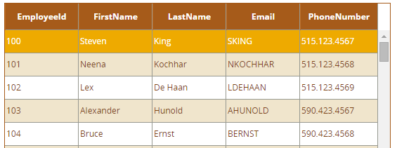
The below image is how the table look and feel after skinning.


The below are the steps to achieve above look and feel .

It's not straight forward approach, We need to apply skinning for each section.

af|table {
background: none;
border: 1px solid #A65B1A;
}

1. ColumnHeader:


af|table af|column::column-header-cell 
{   
height:35px;
color:#ffffff; 
text-align: center;
font-size: 12px;
font-family:'OpenSans-Bold';  
font-weight: bold;
background-image: none;
background-color: #A65B1A;
vertical-align: middle;
border-left: 1px solid #BF691E;
}

2. Data row:


af|table::data-table-VH-lines af|column::data-cell
{
background-color:#fff;
color: #7F4614;
font-size:12px;
font-family:'OpenSans-Regular';
height:30px;
vertical-align: middle;
text-align: left;

3.Data row- Altrenative:

For implementing different css for alternative rows,we need to be change table rowBandingIntervel property to 1.


af|table::data-table-VH-lines af|column::banded-data-cell{ 

background-color:#F0E5CC; 

color: #7F4614;

font-size:12px;   

font-family:'OpenSans-Regular';  

height:30px;   

vertical-align: middle;

text-align: left; 

}

4.Table default row selection:

Some of the requirements like want to show row selection color for the default selected row.


At the time of page load,The default row should selected, It depends on row index value.Normally, First row would be selected.


af|table::data-row:selected af|column::data-cell

{  
background-color: #eeaa00;
color: #ffffff;  
}
af|table::data-row:selected af|column::banded-data-cell
{  
background-color: #eeaa00; 
color: #ffffff;  

}


5.Table row selection:

The row color will be changed based in your row selection.These are the following selectors for that.


af|table::data-row:selected:focused af|column::data-cell

{  
background-color: #eeaa00;  
color: #ffffff; 
}
af|table::data-row:selected:focused af|column::banded-data-cell {
background-color: #eeaa00;   
color: #ffffff;    

}


6.Table row hover:


af|table::data-row:hover af|column::data-cell


background-color: #9bafc8;  
color: #ffffff;  
}
af|table::data-row:hover af|column::banded-data-cell { 
background-color: #9bafc8;
color: #ffffff; 

}


These all are the common requirements for table skinning.And we can also do skinninng for pagination and detail stamp.

Next post i am planning to post how the table support for responsive.This is the open issue for all developers.

Reach me if you have any doubts.
Wednesday, 1 April 2015

Configuring a custom skin in ADF Application

when we create a ADF application in under Jdev 11.1.1,7 version, Jdeveloper could not create any default css file in our application. If we want to create any custom css file, It should be configured some where in ADF application, otherwise css changes doesn't reflect any where.

When you are creating webcenter application css file configuration comes through default.

For configuring our custom css file in to application,These are the following steps.

1.Create trinidad-skins.xml  file in WEB-INF folder of ViewController project.


2.Create Css folder and put our css file into that.


3.We need to give this css file location path into the trinidad-skin file


4.In trinidad skin file add skin family name,because it should refer in to the trinidad-config.xml.

5.Add skin family name in trinidad-config.xml file like below


Once run the application you will get changes of respective css changes.

 For reference download below link.

Friday, 6 February 2015

Css Reuse-Css inheritance in ADF

In most of time we are getting different requirements related look and feel of the components.
For example,In application we have 10 buttons with different background colors, But remaining look and feel is same like width,height and padding e.t.c


If we observe above buttons almost same look and feel only difference background color.
Normally we can achieve this we will create different styleclass and apply skinning for each individual components.

Actual Css:

af|commandButton.greenButton

{
-webkit-border-radius: 28;
-moz-border-radius: 28;
border-radius: 28px;
font-family:  Verdana, Arial, Helvetica, sans-serif;
color: #ffffff;
font-size: 20px;
padding: 10px 20px 10px 20px;
text-decoration: none; 
background-image: none; 
border: none;
outline:none;
cursor: pointer;
background: #3498db;
}

af|commandButton.blueButton
{
-webkit-border-radius: 28;
-moz-border-radius: 28;
border-radius: 28px;
font-family:  Verdana, Arial, Helvetica, sans-serif;
color: #ffffff;
font-size: 20px;
padding: 10px 20px 10px 20px;
text-decoration: none; 
background-image: none; 
border: none;
outline:none;
cursor: pointer;
background: royalblue;
}

In the above css code, Almost all css propertys are same except background, Imagine in application having more than 10 buttons, we will get a chance to increase the css code. It will be affecting the performance of  application. Not only buttons we can use for all components.

One of the way that we can achieve the above functionality by reducing CSS is by applying -tr-rule-ref property.

The below are the steps to implement the -tr-rule-ref property.

1.We need to identify common css in the components.
2.Create one styleclass with alias and put all common css in to that.


.commonButtonCss:alias 
{
-webkit-border-radius: 28;
-moz-border-radius: 28;
border-radius: 28px;
font-family:  Verdana, Arial, Helvetica, sans-serif;
color: #ffffff;
font-size: 20px;
padding: 10px 20px 10px 20px;
text-decoration: none; 
background-image: none; 
border: none;
outline:none;
cursor: pointer;
}

3.-tr-rule-ref synatax.

  -tr-rule-ref: selector("styleclassName:alias ");

af|commandButton.greenButton
{
  -tr-rule-ref: selector("commonButtonCss:alias");
background: #3498db;
}
af|commandButton.blueButton
{
  -tr-rule-ref: selector("commonButtonCss:alias");
background: royalblue;

Thursday, 5 February 2015

commandButton Skinning in ADF

These are the skinning selectors for the commandButton.

Normal Button Css:
af|commandButton.myNewButtonClass{
background: #3498db;
-webkit-border-radius: 28;
-moz-border-radius: 28;
border-radius: 28px;
font-family:  Verdana, Arial, Helvetica, sans-serif;
color: #ffffff;
font-size: 20px;
padding: 10px 20px 10px 20px;
text-decoration: none; 
background-image: none; 
border: none;
outline:none;
cursor: pointer;
}

Pseudo-classes css:

The below are the pseudo classes like hover,focus,active e.t.c.

af|commandButton.myNewButtonClass:focus,
af|commandButton.myNewButtonClass:hover,
af|commandButton.myNewButtonClass:active,
af|commandButton.myNewButtonClass:focus:hover, 
af|commandButton.myNewButtonClass:focus:hover:active {

 background: royalblue;

-webkit-border-radius: 28;

-moz-border-radius: 28;

border-radius: 28px;
font-family:  Verdana, Arial, Helvetica, sans-serif;
color: #ffffff;
font-size: 20px;
padding: 10px 20px 10px 20px;
text-decoration: none; 
background-image: none;
border: none;
outline:none;
cursor: pointer;
}


Tuesday, 10 December 2013

Panel Box Skinning in ADF

Panel Box is most usage components in ADF. In this post I want to show the complete skinning and how we can achieve the good look and feel.

I hope this post should useful for you requirement.

The below screenshot shows that how the panel box component looks without applying skinning.


The below screenshot shows that how the panel box component looks with applying skinning.


These are the selectors to achieve above look and feel.

af|panelBox::header-start:core:default {
    background-image: none;
    background-color: #e0eff9;
}

af|panelBox::header-end:core:default {
    background-image: none;
    background-color: #e0eff9;
}

af|panelBox::header-center:core:default {
    background-image: none;
    background-color: #e0eff9;
    padding: 10px;
}

af|panelBox::header-element {
    font-size: 13px;
    color: #565656;
}

af|panelBox::center:core:default {
    background-image: none;
    border: 1px solid #E1E1E8;
    background: #F9F9F9;
}


af|panelBox::footer-start:core:default {
    display: none;
}

af|panelBox::footer-center:core:default {
    display: none;
}

af|panelBox::footer-end:core:default {
    display: none;
}

af|panelBox::disclosed-icon-style {
    width: 22px;
    height: 22px;
    background-image: url("../images/open.gif");
    outline: none;
    cursor: pointer;
}

af|panelBox::disclosed-icon-style:hover {
    width: 22px;
    height: 22px;
    background: url("../images/open.gif")!important;
    outline: none;
}

af|panelBox::disclosed-icon-style:active {
    width: 22px;
    height: 22px;
    background: url("../images/open.gif")!important;
    outline: none;
}

af|panelBox::undisclosed-icon-style {
    width: 22px;
    height: 22px;
    background-image: url("../images/close.gif");
    outline: none;
    cursor: pointer;
}

af|panelBox::undisclosed-icon-style:hover {
    width: 22px;
    height: 22px;
    outline: none;
    background: url("../images/close.gif")!important;
}

af|panelBox::undisclosed-icon-style:active {
    width: 22px;
    height: 22px;
    outline: none;
    background: url("../images/close.gif")!important;
}

If you want sample apllication for reference download below link,

Download:PanelboxPoc

Friday, 29 November 2013

ADF Popup Skinning

If you want to skinning the ADF popup,First remove the defalut background look and feel.

The below are the global selectors for removing popup background


.AFPopupSelector {

    background-color: #fdfdfe; 
   box-shadow: none !important;
    -webkit-box-shadow: none !important; 
   -moz-box-shadow: none !important;
}
.AFPopupSelectorContentStart 
{  
  background-color: none;
}
.AFPopupSelectorContentEnd
 {   
 background-color: none;
}
.AFPopupSelectorHeaderEnd
 {  
  background-color: none;
}
.AFPopupSelectorHeaderStart 
{   
 background-color: none;
}
.AFPopupSelectorHeader
 {  
  background-color: none;

}